This article has nothing groundbreaking. It is geared towards developers just getting into HTML/CSS and need help getting started with responsive design implementation.
You've seen this cool, "Responsive Web Design" thing before. You know how to design a mobile site and a desktop site. But implementing it? That's another question altogether.
The Design
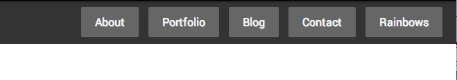
First, let's take a look at the design. Here's how our navigation should look like on a Desktop:
and then on Mobile:
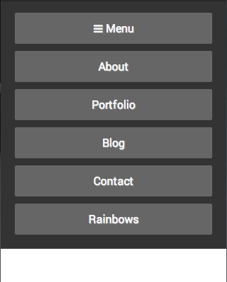
The navigation is to start collapsed with only that Menu button showing, and then which you tap on Menu, then the rest of the nav items show/hide.
Let's Get Meta
An important part of coding responsively is the meta viewport tag.
Here's what it should look like:
<meta name="viewport" content="width=device-width, initial-scale=1.0">
This needs to go in your <head> tag. Here's a quick explanation of what this tag does:
width=device-width sets the default width of the viewport to the width of the device. Without this, the device may automatically try to assume you have a bigger site than you have and may try to show all, say 960px pixels on your device at once, meaning your webpage will be scaled down by a factor of 3 if you're on an iPhone. Everything would be super tiny!
initial-scale=1.0 makes sure that it's showing at 100% size (instead of scaling it) and is nicely paired with width=device-width.
The HTML
So let's start with the desktop nav (why I start at desktop and work my way down is an article for another day).
HTML for desktop only:
<nav role="navigation" class="main-nav">
  <a href="#about">About</a>
  <a href="#portfolio">Portfolio</a>
  <a href="#blog">Blog</a>
  <a href="#contact">Contact</a>
  <a href="#rainbows">Rainbows</a>
</nav>
Let's keep it simple and just use a <nav> element with some <a> tags inside.
From here, it's pretty easy to style and match our design for desktop. I won't include these styles until the final demo.
What about Mobile?
We don't really need to change anything for mobile as far as HTML is concerned (until we get into the toggle). Basically, just changing the anchor tags to be display: block and maybe adjust some margins. If we take a look at our nav on desktop, it's just under 600px wide, so we want to add a breakpoint before we go too far below 600px to start using our mobile version of the nav.
CSS:
@media (max-width: 600px) {
  .main-nav a {
    display: block;
    margin: 10px 0;
  }
}
The Toggle
Let's say we don't have any other good reason to bring jQuery and we want to do this navigation without the use of any JavaScript/jQuery.
The easiest solution is to use a little trick with a checkbox and the general sibling combinator selector: ~.
Let's add a checkbox (that we will hide with CSS) that must be a sibling to the anchor tags. We also need to add a label which we are going to style to look exactly like the anchor tags.
Labels have a for attribute, and if there is a radio or checkbox with an id attribute that matches a label's for attribute, when we tap/click on that label, it will do the same thing as if we had tapped/clicked the checkbox/radio itself.
Thanks to this trick, our checkbox does not need to be inside the label. We could really put that label anywhere and this technique would still work.
HTML for both views:
<nav role="navigation" class="main-nav">
<label for="toggle">☰ Menu</label>
<input id="toggle" type="checkbox">
<a href="#about">About</a>
...
</nav>
That's all the markup we need. Now to make this all work, we need to hide the checkbox (it should always be hidden), and then we should hide the anchor tags when we're below 600px, but re-show them if the checkbox is checked using the general sibling combinator selector.
The relevant CSS:
/* styles for the nav items on mobile (<= 600px) */
@media (max-width: 600px) {
  .main-nav a, .main-nav label {
    margin: 10px 0;
    display: none;
    text-align: center;
  }
}

/* Hide the toggle label on desktop views */
.main-nav label {
  display: none;
}
/* And re-show it on mobile */
@media (max-width: 600px) {
  .main-nav label {
    display: block;
  }
}

/* The nav toggle checkbox is always hidden */
.main-nav #nav-toggle {
  display: none;
}

/* This overrides the display:none in the first rule
   in this code block if the checkbox is checked.
   We want to make sure this only happens under our
   breakpoint, else it could mess with desktop view */
@media (max-width: 600px) {
  .main-nav #nav-toggle:checked ~ a {
    display: block;
  }
}
The general sibling combinator selector (~) will select all of the sibling elements that match the rule on the right of the ~ of the element on the left of the ~.
In this case, all anchor tags that are siblings of a checked element with an id of nav-toggle will have display: block;.
It's important to note that the general sibling combinator selector only works for siblings after the selected element. Meaning if you put an anchor tag before the checkbox, display: block; would not be applied to it and we'd have to use a slightly different approach to get it to work.
**
See the Pen LqBDG by Cameron Spear (@CWSpear) on CodePen.
**As you can see, all the magic is really done with your CSS styles, and you just add a little trick with the general sibling combinator selector to toggle and now you're rocking a sweet responsive nav.
Browser Support
Note that the general sibling combinator selector (~) actually has better support than media queries. This technique will work on IE9+ and all other modern browsers. IE8 supports ~, but not media queries. But you don't really expect people with IE8 to be viewing a website on a very small viewport, so it's usually not a concern.